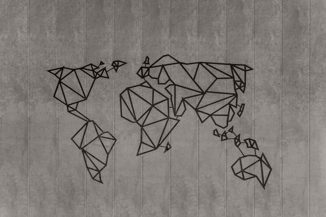
Hidden gems in global maps
Hey there,
Welcome to the 32nd Knowledge•Day issue. Hope you are doing great.
It’s December! The end of the year, and it’s time to look ba-
Geez. I don’t waana look back. This year has affected everyone, everywhere (except antarctica).
Speaking of Antarctica, it’s been a while since I’ve looked at the map. Well, in the times when traveling can be deadly, one would keep it away.
But let’s do a quick run of some of the map facts that are not widely discussed. Did you know about these before? 👇
My land! No, mine!
^ Language of the dogs. And the lions. And kids. And apparently, Countries too.
Just like the jokes and memes, there is no way you can draw a map without offending someone. There are just too many disagreements on borders of different countries that just won’t conclude where the border extends out to.
You’d think there are one or two edges here and there, but this list from Wikipedia lists over 100+ disputes globally. Most of those being from the Asian continent.
But how do you differentiate that on the existing map we follow? What about google maps?
Good question. Speaking of google maps. They can’t just decide a border by themselves when the countries just haven’t solved the disputes. That is why they do what’s called a pro-internet-company move.
Google maps is not the same for everyone. You see what your country believes is true. Yup. Google maps draw up differently based on the country you’re in, just to satisfy everyone. I’ll take my own country for examples.
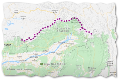
Arunachal Pradesh/South Tibet
Depending on where you look at Google Maps from, this will be drawn as per your liking. For India, this land is Arunachal Pradesh. But if looked at from China, it becomes a part of Tibet. And for the rest of the world, both! With border drawn with dotted lines.
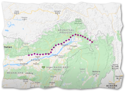
Pakistan/India/China over Kashmir
Ah, this is a popular one. At least for the southern Asia zone. For the uninitiated, Jammu & Kashmir is like the hot girl of lands and literally, every country around wants it. Well, there’s more to it, but I’m trying to keep politics out of here.
So, J&K particularly is interesting because Pakistan, India, and China together are in disagreement about the borders and won’t accept who owns what. As a result, multiple dotted lines in google maps for others to see.
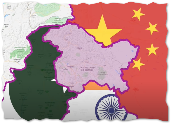
See the dotted lines in the picture above? That is the area that Pakistan and China claim out of India.
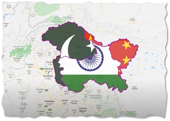
Again, there are more blurry borders, and the undecided borders are visible from the country. So, if you know about the border dispute of your country and would like to see how the GMaps is from outside, just use a VPN to virtually change your location.
Objects on the map are not proportionally scaled
Here’s a question. How can they draw the world map on flat paper or say how does google map show a flat view of the world?
Because the world is flat!
Umm, well I’m not one of them but as far as my logic goes. The world is round and printing the round on a flat rectangle plane surface will affect the sizing of stuff. And it does. The map standard globally followed is called Mercator projection, presented by the Flemish geographer and cartographer Gerardus Mercator in 1569. Which became a standard because it’s conformal, meaning the angles, shapes, and local directions are preserved when drawing round surface on flat. As a side effect, the Mercator projection inflates the size of objects. This inflation is very small near the equator but accelerates with increasing latitude to become infinite at the poles.
If that almost got you sleeping, I have a beautiful example. Look at this map. Greenland and India are highlighted.
Which of the two highlighted portion of land is bigger?
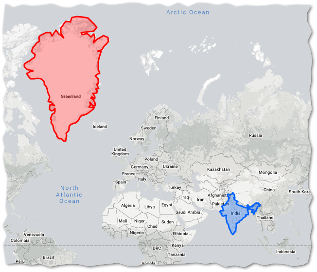
But…
Unless you knew about it before, this could come as a surprise.
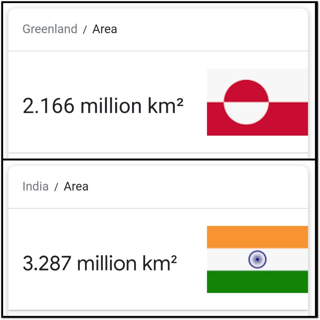
Now here is Greenland stacked next on India with an actual size ratio.
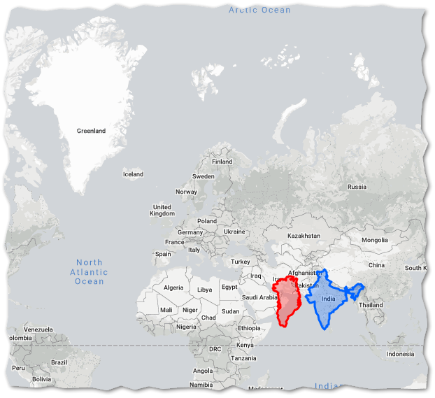
Which also should clear up the fact that Russia is indeed a big country. But not as enormously big as it looks. Here’s an animation from Wikipedia showing proportions of apparent size and real size.
 Objects in the map are smaller than they appear
Wanna play yourself with country sizes? thetruesize.com allows you to size countries and compare at the same levels.
The end
Thanks for coming in. Do you know something else relating to Map that’s uncommon and interesting? Just reply, I’d love to know too.
Hope you liked this issue and as with everything else, and if you haven’t subscribed to the newsletter then just fill the form and I’ll promptly deliver a new cursiosity provoking topic into your inbox once a week.